
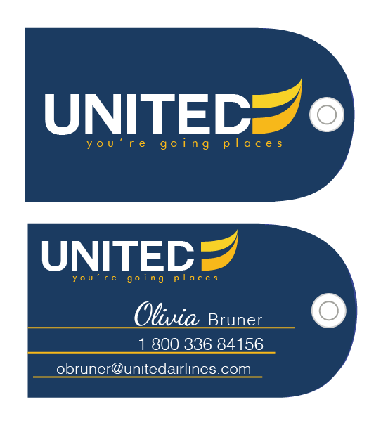
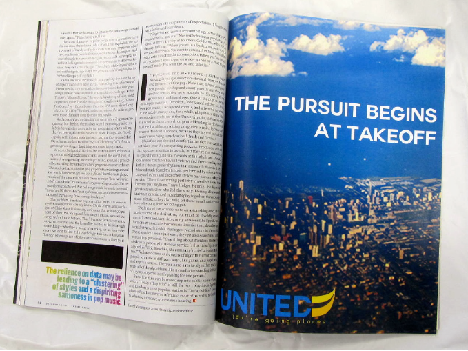
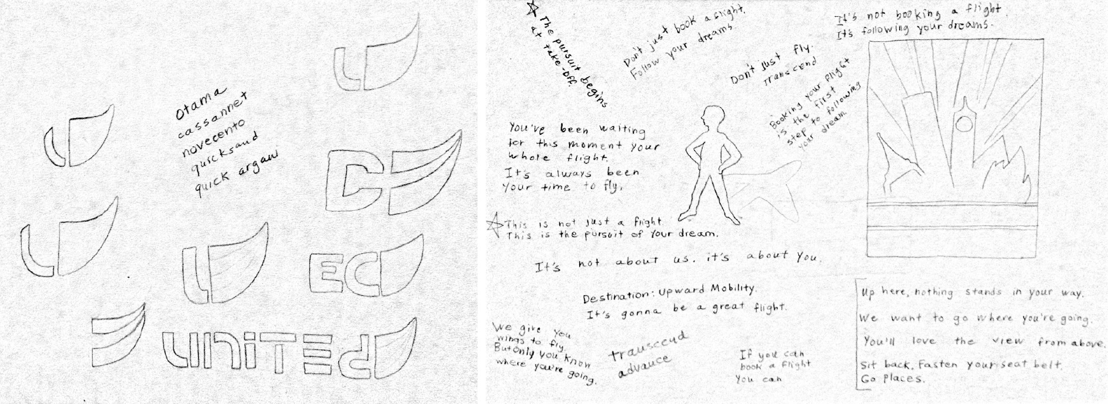
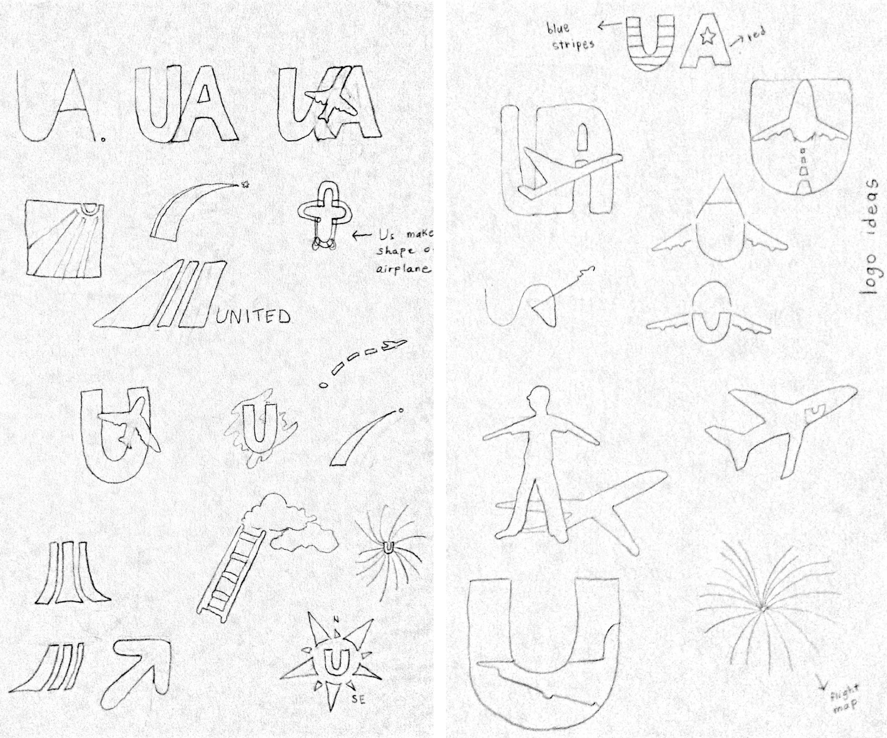
My concept for United Airline’s rebranded image, logo and tagline evolved to carry a wealth of passion and emotional value, traits modern day airlines typically lack. In the rebranded logo, the colors blue (symbolizing confidence and intellect) and yellow (signifying happiness, success and personal power) marry to produce a visual of inspiring professionalism. The typeface of “United” is clean, crisp and timeless. The tagline “you’re going places” is easily legible due to its liberal kerning—it denotes the aspirations of the target audience (business men/women): upward mobility and ultimate transcendence. The customer is not only flying from point A to point B, but also following his/her ambitions on a lifelong journey. With its upward sweeping curve and motivating yellow-golds, the two-toned icon embodies both the literal and figurative meaning of United’s re-envisioned brand message. United passengers are not just going places; they’re pursuing their dreams with latitude.